NEW documentation: This article covers setup for OWOX BI. For the latest guides on setting up FREE connectors and Data Marts, visit the new OWOX Data Marts documentation.
Now you can select metrics and dimensions you want to visualize in a Smart Data report chart.
To do it, on a report page, click Customize chart and pick the report's metrics (123) and dimensions (ABC) you want to see in the chart: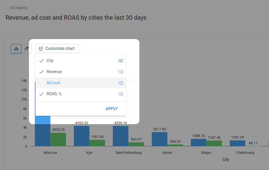
Some chart customization limitations
For now, chart customization is a work-in-progress feature, so it has some limitations while we still working on it. Please, consider them while customizing your report charts.
- A chart can display several metrics broken down by any single dimension OR several dimensions only for the first metric in the report.
- One chart can't display both more than one metric AND more than one dimension at a time.
- When a report contains more than one dimension, but the chart has only one of them displayed, the chart shows the total values of the metrics grouped by this dimension.
- If you select metrics and dimensions incompatible to be shown in one chart, the chart will reset to the default view, which is the first metric in the report broken down by two dimensions. The rest of the metrics won't be visualized.
0 Comments