NEW documentation: This article covers setup for OWOX BI. For the latest guides on setting up FREE connectors and Data Marts, visit the new OWOX Data Marts documentation.
Now you can switch between different chart types to visualize the reports you build in Smart Data.
Each report has an individual set of the chart types you can switch between. You can do it right on the report page using the panel above the chart: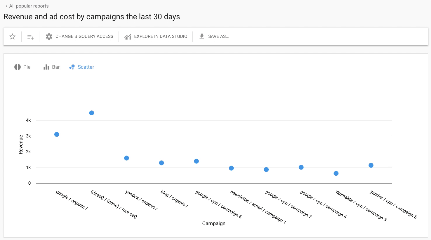
If a certain report has only one chart type available, the panel won’t be displayed.
In total, Smart Data offers 10 possible chart types:
Bar / Stacked bar. A bar chart shows the difference between the categories of data.
Column / Stacked Column. A column chart allows comparing of data by groups or categories.
Line. A line chart displays trends or data over a time period you chose.
Pie. A pie chart shows data as or proportions of a whole, similar to slices of a pie.
Scatter. A scatter chart shows numeric coordinates along the horizontal (X) and vertical (Y) axes. The axes are two variables, and a scatter chart lets you pick out trends and patterns between these variables.
Heatmap. Displays activity by zones.
0 Comments